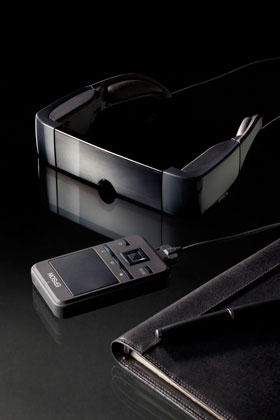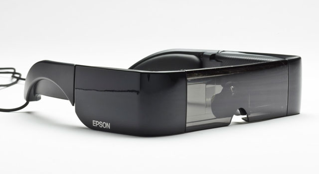
Countless books and movies have imagined what immersive, wearable technology might one day look like. Thanks to Google’s Glass project and wearable entertainment systems like Epson’s new Moverio, the picture is slowly starting to come into focus.
Let’s be clear upfront: Epson’s Moverio is very much first-generation technology. That’s an important caveat because it explains the less-than-ideal implementation of an what is actually not a bad idea.
At first glance, the Moverio looks like something out of a science-fiction film, but first use reveals it to be very much of this world. For starters, the unit is heavier and bigger than it looks. It’s also far less comfortable than the smiling models in the press materials would have you believe.
Supposedly the size makes it possible to use the Moverio even if you wear glasses. That’s simply not true, but more about it later. Heft and bulk may provide reassurance of quality in cars, but in wearable tech it’s a hindrance.
There’s another glaring problem with the Moverio: it makes you look completely ridiculous. Beyond the cumbersome headset, there’s the control box that accompanies it. Add to that a cable connecting the two and you’ve got a complicated system that’s about as refined as wearing a colander and calling it a helmet.
The tinted translucent strip that runs across the face of the device can be removed but given half of the user’s vision is obscured by the display, it makes little difference. Also, it doesn’t make you look any less foolish.
The display is made up of a pair of projectors, one in each arm, projecting onto a pair of angled pieces of perspex, one on either side of the nosepiece.

With a resolution of just 960×540 pixels, using the Moverio is less like an immersive cinematic experience and more like someone’s holding a mobile phone in front of your face.
Thanks to a 3,5mm audio jack on the controller unit, it’s possible to use your own in-ear headphones rather than the underwhelming pair that are supplied and which dangle from the Moverio’s arms. Bafflingly, however, there’s no option for inputting external video, so users are forced to save content to a microSD card.
Being limited to microSD wouldn’t be so bad if the Moverio supported the full gamut of file formats. It doesn’t. If you’re hoping to play .avi or .mkv files, you’re in for disappointment. The only video playback options are Mpeg-4 or H.264. For audio, you’re restricted to MP3 or AAC, although given the distinctly average audio the Moverio produces, and the lack of a visualisations option in the rudimentary music player, we can’t fathom why anyone would want to listen to music using the device anyway.
Despite it’s lack of support for even common file formats, the Moverio packaging brags about its ability to contend with Flash. This is because the device includes Wi-Fi and a browser, meaning it’s possible to watch YouTube videos. You wouldn’t want to, though, because inputting a Web address or search term with the on-screen keyboard and trackpad is excruciatingly painful.
Crude user interface
The glasses portion of the unit connects to a control box that both powers it and feeds it content using a proprietary cable. The box contains a touchpad and the various physical buttons, including the trio of home, options and back as found on most Android devices.
The trackpad is fairly intuitive to use, but it’s hugely impractical when trying to unlock, for example, the screen. Doing so requires a fine combination of tap-and-swipe inputs for success.
Once unlocked, the menus in the Android 2.2-powered Moverio can be navigated using the four-way controller and the selection key it encloses, but the experience remains clumsy.
The four-way controller is flanked by two buttons, one to toggle between 2D and 3D modes, and another to adjust the brightness of the display. Because the 3D setting has nothing to do with the content being played, turning it on means the Moverio applies the effect to everything. In the case of the menus, the result is a thoroughly nauseating experience.

As if there weren’t enough black marks against the Moverio, its battery life is poor. With the brightness and volume turned down, you’ll be very lucky to squeeze three hours out of it.
Apart from being difficult to navigate, the text in the Moverio’s menus suffers from bleed, rendering it blurry. We kept looking for a dioptre switch of the sort found on high-end digital cameras that allows those who wear glasses to make the necessary adjustments for their eyesight.
Speaking of glasses, spectacle wearers we gave it to found it too front-heavy to remain planted on anything but the most Roman of noses.
Finally, there’s the price. Early adopters can expect to pay a premium for a device that’s destined to be superseded fast. In exchange, early adopters get bragging rights — assuming, of course, you’d want to be seen wearing something quite this ridiculous. The recommended retail price is R7 750.
Overall, the Moverio closely resembles early mobile phones in that it’s awkward, impractical, excessively heavy and insufficiently portable but which nevertheless hints at what might follow. — (c) 2013 NewsCentral Media


