China’s fast-growing Huawei — it’s pronounced wha-way — is better known for its network gear than its consumer devices. The company has been making Android-powered budget smartphones for a number of years, but it’s never managed to take on the big names at the top end of the market.
With the Ascend P6, it appears set to change that.
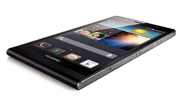
There’s no getting away from the fact that the P6 takes a number of design cues from Apple’s iPhone 5 — and almost certainly deliberately so. From the rounded top corners and recessed Sim and microSD trays to the aluminium edges, the Huawei looks a lot like an iPhone might if Apple made one with a 4,7-inch display.
Huawei says design was one of its primary concerns with the P6 and there’s no denying it’s a great looking device. The company opted for a unibody design, so the 2 000mAh battery can’t be replaced, but it’s sufficiently powerful to make it through a day of heavy use, which is about all one can expect from high-end smartphones these days.
 The most obvious design decision that sets the P6 apart from its rivals is the rounded curve at the bottom of the device. Although it looks great, it results in far sharper corners than those on the top of the device and these tend to dig into the base of the palm with extended use.
Nevertheless, the P6 looks great and otherwise feels sturdy in the hand. This is thanks mainly to its thinness — it’s just 6,2mm thick, or 1,5mm thinner than the iPhone 5 — and its weight of just 120g.
Under the hood
So, in terms of design, Huawei has done a sterling job. But what’s the P6 actually like to use?
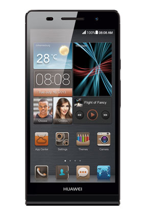
Aside from the power/lock button and the volume rocker on the right-hand side of the device, there are no other physical buttons. For the home, back and menu keys, Huawei decided to go with on-screen buttons. This isn’t a bad design decision as it means users get maximum use of the 720p display.
The display itself, while not in the same league as the 1080p screens on the latest offerings from HTC, Samsung and Sony, is nevertheless sharp, vibrant and easy to use — even in broad daylight. The pixel density is 312ppi, which isn’t class leading, but puts it in the same category as the iPhone 5’s “Retina” display.
Beneath its svelte and minimalist exterior, the P6 houses a quad-core 1,5GHz processor, 2GB of RAM and 8GB of internal storage, which can be expanded by up to a further 32GB via the microSD card slot.
We found the P6 generally responsive, but some applications were slow to load and the animated transitions between home screens show very slight lag.

Thankfully, Huawei hasn’t skimped on the operating system, choosing to take the P6 to market with the recent (but not current) version 4.2.2 of Android’s Jelly Bean. However, fans of vanilla Android may find Huawei’s “Emotion UI” interface a little heavy handed. The app tray is gone, meaning apps have to be arranged in folders or distributed across multiple home screens and all app icons are square, with the bulk of the default apps having custom icons. It’s not unbearable, but it does take getting used to.
Another thing that takes time to get used to is having the microUSB port set off centre on the top edge of the device and having the 3,5mm audio jack on the bottom right edge. The audio jack is “plugged” by default with a pin for removing the Sim and microSD trays. It’s a novel design decision, but we wonder how long it will take users to lose the plug after they first decide to use the jack to listen to music.
One of the ways in which Huawei has really set the P6 apart from the competition — aside from trumpeting it as the thinnest smartphone in the world — is with its two cameras.
Camera quality is often the first thing to get downgraded on cheaper handsets, but the P6 boasts an 8-megapixel rear camera with an LED flash and the ability to shoot 1080p video at 30fps and a 5-megapixel front-facing camera that shoots 720p video.
The front-facing camera is clearly aimed at the youth market, or anyone else for whom the prospect of a 5-megapixel “selfie” is appealing. It’s great to see Huawei looking for novel ways to differentiate its products in an ever more crowded market segment.
Smile, handsome
In keeping with the differentiation theme, Huawei has included a “beauty mode” in its camera software, offering with 10 degrees of “intensity” that it encourages the user to try when using the front-facing shooter.
Designed to remove blemishes and create more flattering portraits, we found it had no effect on some faces (others in the TechCentral office are clearly far too ugly for it to have any effect — Ed) while making others look like they belong in Madame Tussauds.

In addition to great performance from its cameras, the P6 also offers surprisingly rich sound from the single speaker located on the rear of the device.
On the whole, then, the P6 is a hugely impressive smartphone for the price and certainly looks like it could take on Samsung’s Galaxy S4, Apple’s iPhone 5 or HTC’s One. In practice, it’s simply not as powerful, but the bulk of users won’t notice unless they suddenly take to playing graphics-intensive games.
Perhaps the people to whom the P6 is best suited are the tinkerers and other Android fans that like installing custom software on their devices. It’s great looking hardware that is certainly going to get the attention of the custom ROM community.
There are a couple of minor missteps in the P6, but for each there seems to be a thoughtful addition to offset it.
For example, when using the browser, the on-screen keyboard replaces the spacebar with a “.com” shortcut key. Similarly, the music player and gallery apps are worse than the Android defaults.
Still, regardless of its foibles, the P6 shows just how intent Huawei is on competing with the big boys. It looks set to ruffle feathers, particularly in developing markets where price is paramount.
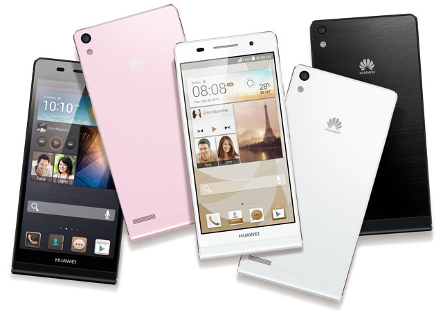
The Ascend P6 is available in white, black and, unlike the iPhone 5, pink, and costs R4 999. — (c) 2013 NewsCentral Media


