As recently as 10 years ago, touch screens in cars were tiny — if they were there at all. Most were grudgingly added by motor manufacturers in anticipation of a US mandate on backup cameras, or an early response to Elon Musk, who dropped a 17-inch monitor into a Tesla in 2012. Destinations were largely DIY, mapped on a plugged-in GPS device or chirped from an iPhone jammed in the cupholder.
Fast forward a decade and touch screens are no longer a reluctant add-on or an innovative perk; they’re table stakes. Some 97% of new cars globally have at least one touch screen, and they are metastasising quickly. Almost a quarter of US cars and trucks now have command displays spanning 11 inches or more, according to S&P Global Mobility; luxury brands are now normalising a separate screen for passengers.
And nowhere is this arms race more evident than in electric vehicles. As battery-powered motors commodify driving — giving sports car-level superpower to giant bakkies and tiny hatchbacks alike — the centre-stack display offers the biggest, brightest space to stand out. The only question is, at what cost?
“The size of screens has tripled from what I thought was huge,” says Gartner analyst Mike Ramsey. “Some threshold was reached … where the car companies said, ‘Distraction be damned, we have to have bigger screens.’”
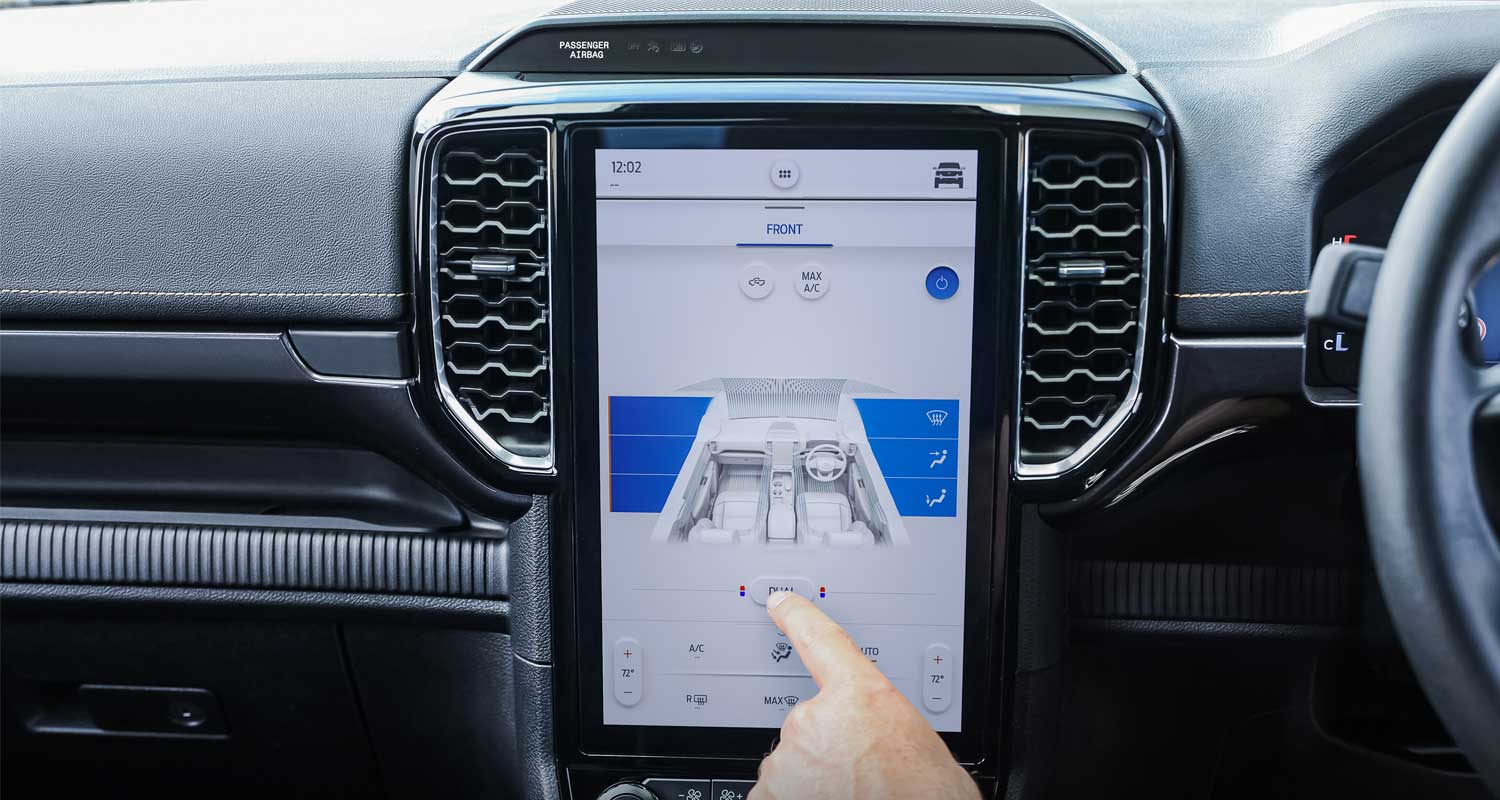
In an electric car, the capacitive pane is the nerve centre of the vehicle: it handles virtually every command and diagnostic, from reading tyre pressure to plotting the best charging stops. It also manages a suite of adjustments that in petrol guzzlers were traditionally tied to buttons and knobs. If a driver wants to adjust her side mirrors, for example, she often has to tap the screen. Shut off or redirect the air coming from the dashboard vents? Ditto.
For Tesla, the decision to throw in a touch screen may have been as much about constraining cost as it was about setting a new standard. When a computer can take over analogue adjustments, the company doesn’t have to make as many precious switches and toggles. What’s more, features can be iterated via over-the-air software updates.
“There’s no question it saves the manufacturer money,” Ramsey says.
Musk’s maths
Younger start-ups saw the magic in Musk’s maths. As Rivian, Lucid and others stood up their own assembly lines, touch screens and the corresponding stack of coding offered an end run around much of the supply chain. Today, Rivian’s new R1T bakkie boasts a touch screen spanning 15.3 inches from corner to corner. Lucid’s Air has a 34-inch “cockpit display”. Tesla’s Model S still has its 17-inch pane, but now it tilts from side to side and has souped-up resolution for playing videogames.
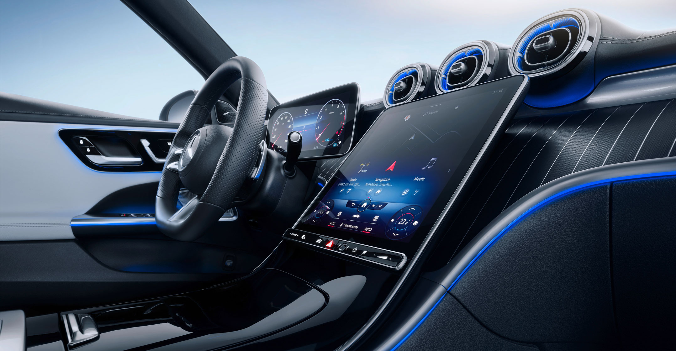
For motoring industry incumbents, meanwhile, giant screens are increasingly imperative, particularly in the EV game. Consider Ford Mustangs: in 2021, the petrol-burning version came with a 4.2-inch display, while the Mustang Mach-E, an all-new battery-powered machine, boasted a 15.5-inch screen. In the batch of new EVs from Mercedes, nearly the whole dashboard — 56 inches of width — is made of three separate touch-screen displays and eight computer processing units. The suits in Stuttgart call it the “Hyperscreen”.
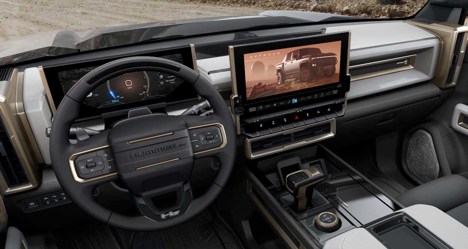
America’s General Motors also dialled the screen to 11 for its Hummer EV. There’s a 13.4-inch display in the centre of the cockpit and another 12.3-inch pane in front of the driver. Change the drive mode and the screens play a short animated video of the truck crawling over obstacles.
Part of the thinking, at least early on, was that touch screens would be a safer and more familiar user experience, considering how much time people spend on their smartphones. More recently, the giant displays have become a convenient (and cost-effective) way to sell subscription services and tout new features like customised driving modes.
“Certainly we can discuss whether a touch screen is the best solution or not, but everyone is used to it,” says Stephan Durach, a senior vice president who leads BMW user experience. “If people see something, they want to touch it, so just make it touchable.”
But a technology can isn’t necessarily a technology should. Ironically, a lot of drivers don’t love these totems — or at least don’t love how they work. Every few years, Consumer Reports asks tens of thousands of people how they feel about their cars’ so-called infotainment systems. Every time, the largest, flashiest packages rank near the bottom in terms of satisfaction. Luxury brands fare particularly poorly, while more pedestrian vehicles — with a more utilitarian approach to technology — are rated more highly, explains Jake Fisher, Consumer Reports’ senior director of motor vehicle testing.
“You’re constantly bombarded by these features you may not be using every day,” Fisher says. “How do you justify the price of a $100k vehicle? You say: ‘Well look, your Honda doesn’t do that.’”
Kyle Conner, founder of the Out of Spec YouTube review channel, has a straightforward take on Rivian’s touch screen UX: “I hate it more than anything.” Meanwhile, Wall Street Journal car critic Dan Neil likens navigating the new Mercedes infotainment system to learning how to play a triple-decker Wurlitzer organ.
While backup cameras have been a safety success, the arms race they kicked off also appears to be increasingly dangerous. There’s ample evidence that fiddling with a giant dashboard display while driving isn’t much safer than tapping at a smartphone.
“Basically, taking your eyes off the road for about two seconds increases crash risk and that risk goes up monotonically over time,” says David Strayer, a psychology professor and head of the University of Utah’s Applied Cognition Lab.
Basically, taking your eyes off the road for about two seconds increases crash risk and that risk goes up monotonically over time
Strayer’s lab studies how easy it is to accomplish simple tasks — calling a friend, for example — in a range of vehicles. It developed a system to measure visual and mental distraction while recording how much time each task requires. All three factors are then mashed into an index score and compared to a threshold of what might be considered safe. Today, the scores for many vehicles breach that benchmark level all the time. A complex task, like typing in a destination, often breaks the safety threshold by more than double.
“For the most part, what the [car makers] deliver is not a usable product,” Strayer says. “Most people we talk to say ‘Heck, if it’s in the car, it must be safe to use.’ And I don’t think that’s an unreasonable assumption.”
Part of the problem is a common user experience paradox: capability — the sheer breadth of what can be accomplished — is often at odds with usability. For motoring executives, flashy touch screens are a great way to highlight new features, but that can come at the expense of more pedestrian stuff. Making massaging seats and ambient light patterns as easy to find as climate controls may be helpful at the dealership, but proves less so in daily use.
In time, the slouching giant centre screen may not hold. Last month, BMW unveiled a screenless concept car, dubbed Vision Dee, built around voice controls and an augmented reality display that projects navigation prompts and other information on the windshield like so many Pokemon.
“We are really cautious about distraction,” says BMW’s Durach. “Our highest priority is eyes on the road and hands on the wheel. We don’t even like the saying that a car is an iPhone on wheels.”
BMW’s current cars, even those with touch screens, also use a combination of maintained haptic switches, fine-tuned voice control and in some cases gesture control. If the driver wants to turn up the volume in the new iX, for example, he can simply twirl his finger in front of the dashboard. Still, the car maker’s screens aren’t tiny — nearly 15 inches on its top models. BMW also recently integrated YouTube and cut a deal to stream German matches in its i7 sedan, though both are disabled when the vehicle is moving.
“At the end of the day, it’s about giving the customers a choice,” Durach says. “The screen makes it a little bit easier on one side and complicated on the other side, because you have to decide what you are going to allow and what you’re not.”
Mercedes says the Hyperscreen, despite its size, can serve as an antidote to distraction. The system uses artificial intelligence to eliminate tedious scrolling. If the driver calls the same person at the same time every week, for example, the screen will prompt them at the appointed hour. “We strive to only show the content our customers want to see to ensure a truly digital luxury experience,” says Magnus Oestberg, Mercedes’ chief software officer.
Gartner’s Ramsey, meanwhile, thinks the Hyperscreen and systems like it are only a pit stop in driver experience; consumers can expect the tech to eventually shrink. By the end of this decade, he says, voice control in cars will catch up to — or even be powered by — Amazon’s Alexa, while increasingly autonomous cars will require drivers to do far less driving. At that point, travellers may prefer their handheld screens and dashboard displays will shrink or disappear entirely. “It will be kind of like what we’ve seen happen in the back of the minivan,” Ramsey says. “Kids don’t need seatback screens anymore, because they have tablets.”
Vibe check
Rolls-Royce is already giving its displays a vibe check. The company’s seminal electric model comes with an understated, horizontal screen; CEO Torsten Muller-Otvos says it’s in part to make the cockpit a sort of sanctuary. “There is no need for some outstanding unseen super funky digital features,” he says. “You have other cars for that in your garage.”
For other brands, however, there’s still dashboard real estate to cover. S&P analyst Anna Buettner says the future of car cockpits is most evident in China, where Byton, a start-up, has essentially built a 48-inch wide computer on top of the dashboard. “They have all kinds of stuff we’re not seeing here yet — rotatable screens, pillar-to-pillar screens across the whole car,” Buettner says. “All of that is definitely coming.”
The Han, an electric sedan made by Shenzhen-based BYD, even comes with a microphone for karaoke. Forget the destination; focus on the Journey. — (c) 2023 Bloomberg LP


