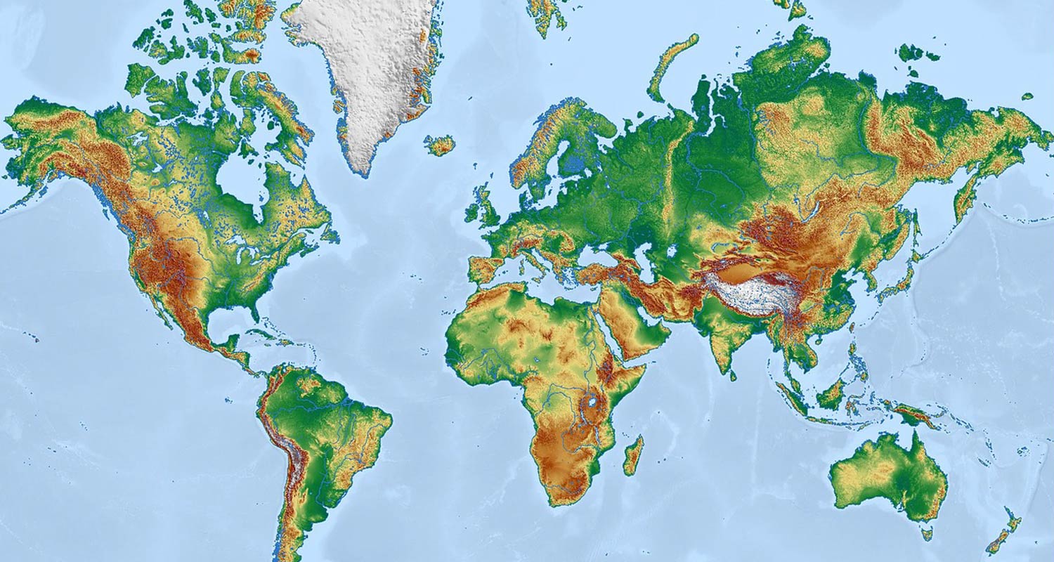
On 4 September, the UN General Assembly voted 164 to one to encourage the world to stop drawing itself on Gerardus Mercator’s 1569 projection – the world map everyone learnt at school.
The non-binding resolution, tabled by Togo for the African Group and the African Union under the banner Correct the Map, recommends the Equal Earth projection instead.
Six countries abstained, among them Ukraine, which objects to the way Equal Earth maps render Russian-occupied Ukrainian territory. The US cast the only vote against, its deputy representative to Ecosoc, Yaryna Ferencevych, dismissing the resolution as a “radical ideological project”.
“A fair map does not change the geography of the world; it changes how we see the world,” Togo’s foreign minister Robert Dussey told the assembly.
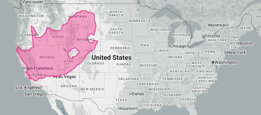
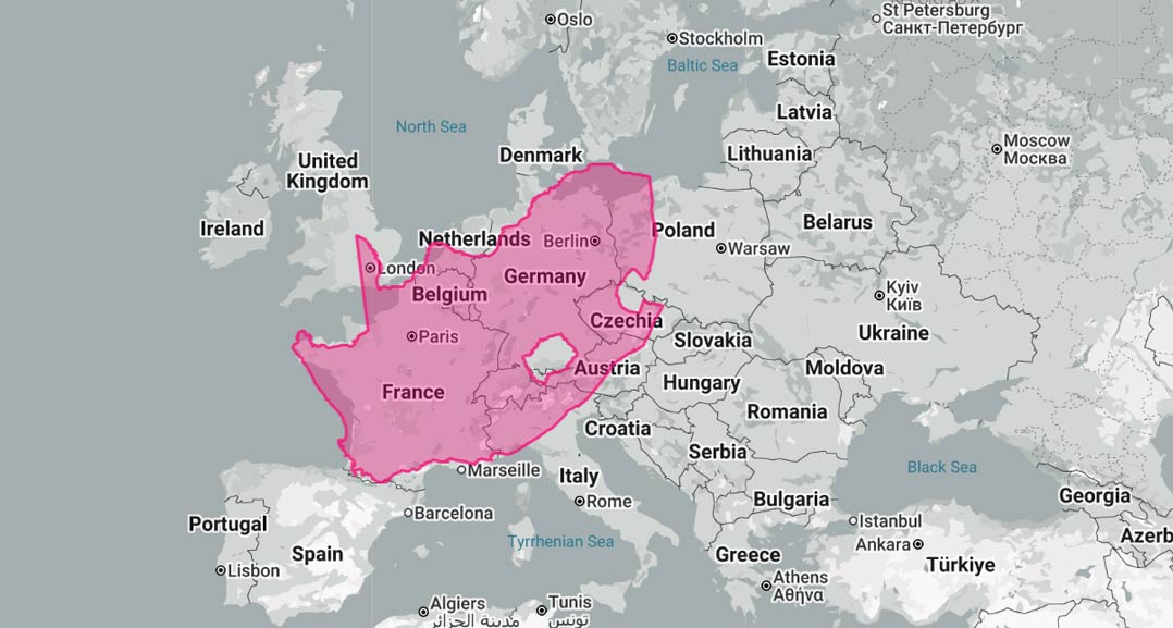
South Africa covers 1 221 037km², making it the 24th-largest country on Earth and the ninth largest in Africa. That is twice the size of France and five times the UK.
Mercator maps do not shrink South Africa. In fact, they do the opposite. The projection’s area distortion grows with the square of the secant of latitude, so at our area-weighted mid-latitude of roughly 29°S we are drawn about 31% larger than we really are.
The trouble is that many other countries get an even bigger bonus, depending on where they land on the curve. The contiguous US, centred near 39°N, is padded out by about two-thirds. China, near 35°N, is inflated by about half. Alaska, at 64°N, is drawn at more than five times its true area. Of the giants, only India – centred near 22°N 0 – gets less flattery than we do, at roughly 16%.
Larger than they are
The distortion is not that South Africa looks small. It is that the countries we benchmark against look far larger than they are, while the equatorial states we share a continent with – and lay railroads and cables to – are drawn honestly and therefore look negligible. The Congo basin, for example, gets no inflation at all.
Africa itself covers 30.3 million km², about a fifth of the world’s land, across 54 countries. That is roughly 14 times the size of Greenland, which Mercator renders as a near equal.
The problem is the debate still isn’t settled, and may never be. The week before the vote, Google Maps began showing Lake Ontario as “Lake America” to users inside the US, following an executive order signed on 27 August and its adoption by the US Geographic Names Information System. Canadian users still see Lake Ontario.
Ontario premier Doug Ford answered with a billboard-sized sign on the Canadian shore at Winona: “Lake Ontario. Now and forever.”
On Google Maps, South Africans – and presumably people from other nations, except the US – still see Lake Ontario. But the Gulf of Mexico is rendered as “Gulf of Mexico (Gulf of America)” to non-US Maps users. That is the actual state of world cartography: not one authoritative picture, but a geolocated one, served by IP address, which rather undercuts the notion that a UN assembly vote can conjure a single map into being.
Mercator is still the default on the platforms we use every day. Almost every digital map – Google Maps, Apple Maps, OpenStreetMap and the delivery apps built on them – draws the world in a version of it called Web Mercator. It survives for good reasons: it keeps shapes and angles true close up, north is always at the top and it slices neatly into square tiles. It makes an excellent street map and a bad picture of the world.
Almost nobody who builds real infrastructure uses it, though. Nor, strictly speaking, does your phone.
Satellite positioning does not use a flat map at all. It works in latitude and longitude on a model of the Earth’s curved shape, and the flat picture on your screen is drawn afterwards. South Africa has its own reference system for the real thing: Hartebeesthoek94, in use since 1 January 1999, anchored at the radio astronomy observatory outside Pretoria that gives it its name. Surveyors work off a grid built on it: a Mercator of sorts, but a local one, accurate because it never tries to draw the whole world at once.
Subsea cable planning is the same. The cable maps that circulate online are diagrams, not routes. Real paths are the shortest lines across a curved Earth, and real distance is what gets paid for.
In orbit, where Amazon Leo is heading for a 2027 launch here on Herotel’s licences, what a satellite can serve depends on how much ground it passes over. Mercator flatters the far north and south – physics doesn’t. Satellite coverage, fibre networks, cable paths and railroads never ran on Mercator.
To be fair, Mercator was never really a lie. It was built for one job – letting a sailor draw a constant compass bearing as a straight line – and the stretched sizes were the price of that trick. The mistake was hanging it on the classroom wall. — © 2026 NewsCentral Media
- Subscribe to TechCentral’s daily newsletter
- Get breaking news alerts on WhatsApp