Motorola’s Xoom has (finally) gone on sale in SA. Though it was originally regarded as the ultimate Android response to Apple’s iPad, much has changed since it was first released in international markets in February. TechCentral’s Craig Wilson spent some time with the Xoom to see how well it stacks up against the competition.
The Xoom — which has a recommended retail price of R6 599 — comes preinstalled with Android 3.0 (Honeycomb) from Google, but this can be updated to 3.1 immediately. The update is necessary to enable the SD card slot, which allows expansion of the Xoom’s 32GB of internal flash memory by up to another 32GB.
Though the Samsung Galaxy Tab 10.1 is today regarded as the iPad’s greatest rival, the Xoom was lauded highly when it came out. It won the coveted award for best tablet at CES in January. However, SA consumers won’t be comparing the tablet to what was available at the start of the year, they’ll be matching it up against what’s on sale now. And, despite the Xoom’s impressive specifications, it has a couple of glaring problems when compared to its nearest rivals.
The main problems are that the Xoom is heavy and relatively thick. At 730g, it weighs the same as the first generation Wi-Fi-and-3G iPad, but that makes it 120g heavier than either the iPad 2 or the Galaxy Tab 10.1.
Also, like the first iPad, it’s considerably thicker than either the iPad 2 or Galaxy Tab 10.1. The result is a tablet that feels bulky and heavy, and one that demands to be handled with two hands at all times. These aren’t minor problems.
 The Xoom could be considered a great device when it came out, but six months is an aeon in technology terms.
Let’s look at its specifications. It’s powered by Nvidia’s Tegra 2, 1GHz dual-core processor and has 1GB of DDR2 RAM. It supports just about every major video and audio file format, includes a GPS, an electronic compass and even a barometer (for the weather geeks).
There’s also a dual LED flash with a 5-megapixel rear-facing camera, a 2-megapixel front-facing camera — better than the VGA offering on the iPad 2 — and it’s possible to connect the Xoom to any HDMI compatible screen (cable not included).
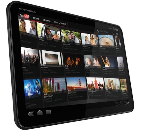
The Xoom’s screen deserves special mention. At 10,1 inches and with a resolution of 1280×800, it’s bright, crisp and capable of HD video playback — and is responsive to the touch. It’s clear that in the specifications department the Xoom holds its head high, even if it is the chubby kid out of the current pack of tablets on the market.
But what’s it like to actually use? We have a couple of criticisms of the Xoom in this department. The decision to put the power/unlock button on the rear is strange, and one that takes some getting used to.
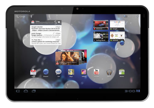
Then there’s the user interface (UI) itself. Strangely, the Xoom only allows widgets and shortcuts to be placed a minimum of an inch away from the left and right sides of the screen when in landscape orientation — no doubt to allow it to squash everything in when in portrait mode. It’s also pretty restrictive in terms of how close together you can place widgets.

But given the camera is centred above the screen in landscape mode, and the placement of the power/unlock button also suggests landscape is intended as the default orientation, there was surely a better solution than forcing users to sacrifice an inch of screen real estate on each side, on each home screen.
Motorola has opted to put the notification bar, which includes a digital clock, connectivity and battery indicators as well as the back, home and switch application buttons along the bottom of the Xoom’s display. It works well enough, but in order to access things like Wi-Fi settings users have to tap the connectivity icon, then a settings icon, and then Wi-Fi.
We didn’t like the Xoom’s unadorned and overlay-free Honeycomb UI out of the box, but we love the possibilities the processing power and screen afford the intrepid Android fan who isn’t afraid of doing a little bit of interface tweaking.
However, no amount of fiddling is going to make the Xoom weigh any less. And that’s really the problem: the Xoom was great in its day, but it doesn’t stack up anymore, especially not next to the only slightly pricier Galaxy Tab 10.1. — Craig Wilson, TechCentral
- Subscribe to our free daily newsletter
- Follow us on Twitter or on Facebook


