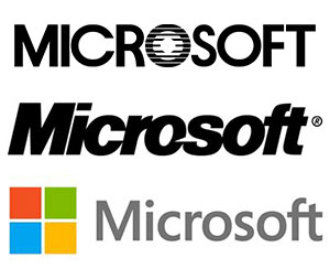
In a not entirely unexpected move, Microsoft on Thursday unveiled its new corporate clothing with the first update to its logo in 25 years. The overhaul comes just as the US software maker is gearing up for one of the biggest product release cycles in its history, including new versions of Windows and Office.

“It’s been 25 years since we’ve updated the Microsoft logo and now is the perfect time for a change,” the company says in a blog post.
“This is an incredibly exciting year for Microsoft as we prepare to release new versions of nearly all of our products. From Windows 8 to Windows Phone 8 to Xbox services to the next version of Office, you will see a common look and feel across these products providing a familiar and seamless experience on PCs, phones, tablets and TVs.”
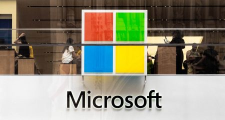
The logotype is rendered in Segoe font, the same font used in its products and marketing communications. The company intends using the revised symbol of four coloured squares at the end of its television advertisements, in its US retail stores and in all future products and marketing materials.
Gone are the italicised text and the flourish on the “o” in favour of plain text and a simple, two-dimensional image. For a long time, Microsoft favoured elaborate versions of its multi-coloured Windows flag. It appears the company has decided that simplicity is best. — (c) 2012 NewsCentral Media


