 I’ve been wearing the Apple Watch for a month. Not because I’m forced to — even though it relates directly to my new career at immedia1 — but because I’ve actually wanted one since Tim Cook’s “one more thing” moment at Apple’s September 2014 iPhone 6 event.
While it’s clear this is a “version one” product, it’s noticeably more refined, polished and useful than other first-generation Apple products; the iPad, for instance (and the original iPhone). There is, however, a similar amount of deliberate hamstringing. For those other products there were specific technical limitations (processing speed, screen technology, and the like). With the watch, it’s all battery (more on that later).
Apps aren’t actually apps. For the most part2, they’re appendages of apps on your iPhone. This is going to change, with developers being allowed to make their apps do more on and use more of the watch. There is — as always — significant expectation surrounding Apple’s Worldwide Developer Conference keynote on Monday, where these details on an expanded SDK will be announced.
So if it’s this limited (for now), what is the watch useful for?
I deliberately didn’t pen any thoughts on the Apple Watch shortly after getting it in late April. This is a device that’s very difficult to “review”. And I’m not alone. This is a common refrain and one voiced over and over by John Gruber, respected commentator (and blogger) on all things Apple. Not that this is a product review. For that, nothing can top The Verge’s definitive Apple Watch review3.
Cook wasn’t being hyperbolic calling the Apple Watch “the most personal device” the company had “ever created”. This is something that’s on you all day. It’s not in your pocket. It’s not on your desk or in your bag.
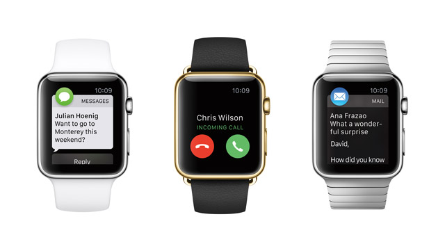
Yet, given the technical limitations right now, the watch is most useful for things that are reactive — the most obvious is notifications. Now, you’re likely wondering why you’d want a torrent of notifications tapping you on the wrist (and pinging, if that’s your thing) all day. That’s the beauty of the watch. Just because a notification arrives on your iPhone, does not mean it appears automatically on your wrist. The granularity offered by the iPhone’s Apple Watch app (which allows you to “manage” the device) is useful.

But I can already see why nuanced, intelligent notifications are going to be the future. What if I only wanted message notifications on my watch from certain contacts? There’s so much obviously possible by Apple leveraging its “Favorites” and “VIP” designations in contacts (iMessage?) and e-mail, respectively. And what happens in a few years (months?) when Apple “knows” that a certain notification is important enough to warrant it showing on my wrist, even though everything else from that app isn’t “allowed”?
Where the watch isn’t as useful — yet — is in tasks that are proactive. Most of our time on our phones involves (or at least starts off with) a deliberate action. We open Facebook or Twitter, or check e-mail, or use maps to find something, we go to a website, we look up a sports score, we call an Uber… Fulfilling that kind of intent is difficult on the watch, primarily because of screen real estate. There’s no space for complicated hierarchies or menus.
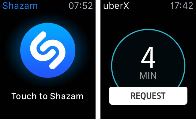
Where apps on the watch excel is in offering a single action (or at worst, two). Uber has absolutely nailed it. So has Shazam. These apps are really, really good. Each has precisely one button. And in each case, that button nails the specific “job to be done” which the app is being hired to do, as per Prof Clayton Christensen’s landmark theory.

Apps are not the only proactive interaction on the watch. Glances — essentially app “widgets”, accessible when you swipe up from the bottom of the watch — fit somewhere between notifications and apps. These are for the passive display of information (think market indicators or weather or the watch’s built-in battery indicator), but still require proactive intent to access.
Analyst Horace Deidiu (brilliantly) theorises that the “Watch offers a hierarchy of surfaces onto which software can compete for attention:
- The complication layer
- The notification layer
- The glances layer
- The app screen
This hierarchy shows where the typical owner will spend most time interacting with their watch. (Complications are effectively passive modules of live data that you can add to certain watch faces. Right now, these are limited to Apple’s built-in apps like weather (temperature and sunrise, sunset), activity, calendar, stocks and clock-related apps like timer).
The more you live with the watch (and the more you allow it to become part of your daily life), the more useful it becomes. That sounds obvious, but it’s not.
The value is incremental. Tiny slivers of time are saved by not having to yank your phone out of your pocket a hundred times a day, only to discover it’s an unimportant message the majority of the time. It means that ignoring a notification can be an action in itself. A quick glance at the wrist, that’s all. It sure as hell makes meetings more productive4 (with the bonus that half the room isn’t distracted by their phone rather than being “present”).

This is one of the things that makes the watch impossibly hard to demo. I’ve lost count how many times over the last month that someone’s asked me “Is that…?”
Because it’s so personal (and because the screen is so small), there’s not much to show off5.
Even though smartwatches and wearables have been around for a few years already, what makes Apple Watch the device that defines the category (so much so that it’s going to redefine the word “watch”)? Someone far smarter than me (possibly Gruber or Deidiu or Ben Thompson of Stratechery) summed it up superbly on a recent podcast episode: “Apple has built a watch that does more, not a phone that does less.” Compare this to competitors’ devices in the category and you’ll see what I mean.
Should you get one? This is impossible to answer. Probably. That’s is the best I can muster. I have a strong hunch that those people who, with the most conviction, can’t see a use for the Watch will be those who will derive the most value from owning one.
The killer app? Currently, Activity. Apple’s built-in app that tracks (active) calories and exercise (and which reminds you to stand once every hour) is just delightful. Making sure all three circles are filled each day is something I obsess over (gamify something, and typically I’m hooked). Of course, there’s the side-effect that I’m more active and therefore healthier. Discovery will be pleased.
And the battery? A complete non-issue. I’ve easily lasted all-day with heavy use. When I’ve forgotten to charge it (mostly while travelling), I’ve managed a few hours into day two as well. Make peace right now with the fact that you’re not going to get a watch that lasts two or three (or seven) days from Apple, at least not soon. Follow the pattern, it hasn’t done so with the iPhone or the iPad or MacBooks. Why would the Watch be different? Any improvements in battery will be used to make other enhancements, like adding GPS (and down the line, its own cellular connection). Plus — hey — who will remember to charge their watch every second day. With a daily cycle, charging becomes a habit.
I’ve (deliberately) not included thoughts on input methods — the Digital Crown, touch (and Force Touch) as well as Siri (which is suddenly very, very good) — nor have I dwelled at all on the “time” aspects or the deeply personal communication options the watch offers (like sharing your real, live heartbeat with someone close to you). I’ve also not shared some of the obvious potential I can already see for apps. That’ll come.
- Hilton Tarrant works at immedia, specialists in native mobile app and Web development
- This article was first published at www.immedia.co.za and is republished from Moneyweb with permission
- Perhaps this is the Holy Grail … a job where an Apple Watch is a deductible expense!
- Only Apple’s clock-related apps are standalone (and don’t work with their iPhone companion)
- Gruber’s thoughts — while not strictly a review — are also definitely worth a read, even though his piece is over 5 000 words
- Given that all five exco members at immedia have Watches, I’ve had a glimpse into the future, so to speak
- This doesn’t stop the oohs and aahs from people when they see the app icons screen (probably because it looks so good)


