 Was Microsoft really that desperate to distance itself from what commentator Paul Thurrott calls the Windows 8 “Frankenstein’s monster” that one full version number for the next version wasn’t enough?
Microsoft announced this week that it will jump past version 9 and go straight to Windows 10.
The official line from Redmond is that it’s to signify that the next version, due out in final form in about a year from now, is a really big deal. But the changes — the new operating system will be a mash-up of the best elements of Windows 7 and Windows 8 — aren’t really that dramatic.
Certainly, the operating system isn’t being rewritten from the ground up, so it does seem that Microsoft wants to move on from Windows 8 as fast as possible. Like the runt of the litter, it’s not getting much love.
The problem with Windows 8 — and its upgrade, Windows 8.1 — is that it feels like two operating systems in one. It has a split personality.
It offers users the traditional desktop, albeit without the Start menu first introduced in the mid-1990s with Windows 95, but it also has a tile-based user interface — the modern UI, also called Metro — which is designed first and foremost for touch, not keyboard and mouse. The two interfaces never gelled. The modern UI felt like a kludge, a solution in search of a problem.
Crucially, business users haven’t warmed to it. Hundreds of millions of cubicle dwellers in offices around the world still use traditional desktops and laptops whose only inputs are the traditional mouse and keyboard. The new form factors Microsoft is targeting with Windows 8’s modern UI — tablets, convertible laptops — haven’t taken off as quickly as the company had hoped.
In version 8.1, Microsoft began backtracking. It reintroduced the Start button, although clicking it still only brought up the tile-heavy modern UI. And it made it possible for users to boot their computers directly to the desktop instead of into the modern UI. It was an embarrassing reversal.
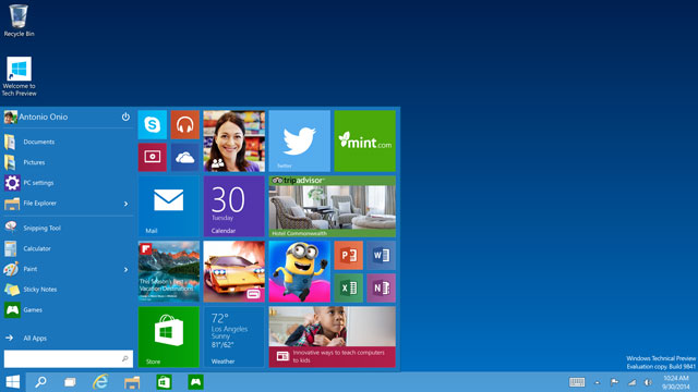
The company will retreat even further with Windows 10. First, the Start menu is back. Though the operating system will still work well on tablets, it looks set to be a lot more like Windows 7 in the way that keyboard and mouse users interact with it. It’s likely to go a long way in appeasing the corporate IT managers who have shunned the modern UI. And appeasing the enterprise market is crucial for Microsoft. It must give them compelling reasons to keep upgrading.
For consumers, Windows 10 should also be less intimidating. Although the Windows 8 user interface is not difficult to master, Microsoft had conditioned computer users over decades to look for a Start menu. Removing it was bound to lead to resistance and confusion, even anger.
“This will make it more palatable to Windows 7 users,” said Mary Jo Foley, an American technology journalist and expert on all things Microsoft, after this week’s announcement.

In many ways, Windows 10 will do away with Windows 8’s dual personalities. It’ll still work well on touch devices, but will offer a more traditional computing experience to desktop users, who will even be able to run modern UI apps windowed on the desktop. Indeed, the new operating system looks set to be what what Windows 8 should have been.
Perhaps we shouldn’t be surprised. Microsoft seems to have settled into a “good release, not-so-good” release cycle with Windows.
XP, which debuted in 2001, was followed by the disastrous (at launch) Vista; the acclaimed Windows 7 was succeeded by Thurrott’s Frankenstein’s monster. If Microsoft keeps to form, Windows 10 will be top notch.
That’s perhaps a good thing given that it could be the last big version of Windows. After Windows 10, Microsoft could abandon big product release cycles in favour of smaller, more regular iterations. The software looks set to become more a service than a packaged product. In that respect, the next version of Windows could mark the end of an era in computing.
- Duncan McLeod is editor of TechCentral. Find him on Twitter
- This column was first published in the Sunday Times


