By Jolie O’Dell
Apple has long been known for its intense focus on consistent branding and beautiful simplicity. Although this week’s Apple event unveiled a couple of new improvements to an expected line-up of products, it also revealed a certain sloppiness that was absent from earlier, Steve Jobs-led launches.
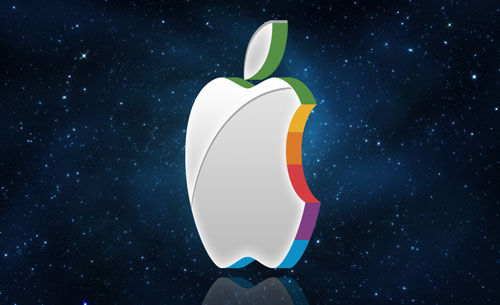
This wasn’t anything major, just a few minor but glaring inconsistencies: new CEO Tim Cook going for the “rumpled executive” look in an untucked shirt, the ambiguous naming of the “new iPad” (not iPad 3 or iPad HD), the use of a horrible pun on a new product’s landing page and, finally, the tie-dyed Apple logo at the presentation’s conclusion.
These are not the kinds of things I normally care about. They have nothing to do with hardware and nothing to do with technology. But Apple’s ethos is about so much more than hardware and technology: it’s supposed to be, as this outsider sees it, about aspiration, dreams, desires, the future, even Utopia. In a word, it’s only 30% about the tech and 70% about the branding.
Think about the company’s meticulous attention to packaging details, the layout and lighting of its signature stores, the exacting control it maintains over partners and apps, the unwavering emphasis it places on design. And all of that was started and maintained by Jobs.
I’m certainly no Jobs fangirl. I hold the guy in appropriate regard for his many accomplishments and also recognise in him his many human foibles. But love him or hate him, he was a visionary and a perfectionist who would be almost impossible to replace.
Today’s Apple event shows that perfectionism fraying a bit around the edges. The bad pun, the goofy logo, the weird product name — all of it pointed to a leadership that either didn’t understand or didn’t care about consistency in iconography.
Jobs, and the Apple brand under him, were individually and collectively icons. Jobs was a personality and also a caricature of the personality, with his trademark uniform of black turtlenecks and jeans and his signature phrases: “make a dent in the universe”, “think different”, or even “one more thing.” Like icons from Cary Grant to Lady Gaga, he understood that a certain presentation was what the public expected of him.
Likewise, the Apple brand stood for beauty in simplicity. Devices without a cluster of buttons were the uniform. A narrow selection of elegant fonts were the language. And nomenclature was consistent enough to become one of the most hotly speculated-about features of any launch. Would it be called the iPhone 2? The iTablet? The iPhone 5 or the 4S? The 4SG? Think about how little anyone cares about the name of HTC’s next smartphone or Google’s next bit of software and you’ll see how important that one small detail of nomenclature was to Apple’s iconic position in the world of tech and consumer brands.
This week’s event and the tiny but glaring inconsistencies bring up the impossible-to-answer question: would Steve have approved that?
No one can say definitively whether the term “resolutionary” would have passed muster under Jobs. He’s gone. While fragments of him live on in the company’s website and wording and product design, that likeness is destined to degrade over time.
At some point, it’s within the scope of my own limited imagination to envision Apple products that bear little or no resemblance to anything Jobs created. Last time Apple was without Jobs, it came out with a line-up of duds. Do you remember Apple’s digital cameras, speakers or video game consoles? Or how about the company’s Newton PDA? While Apple was cranking out those dogs, Jobs came up with Next (later to become the foundation of OS X) and Pixar.
This week we saw the first cracks in what will eventually become a wholesale break with the past. What happens next will depend largely on the company’s ability to lead itself now that its founding leader is gone. — VentureBeat![]()
- Jolie O’Dell is a writer for VentureBeat
- Subscribe to our free daily newsletter
- Follow us on Twitter or on Google+ or on Facebook
- Visit our sister website, SportsCentral (still in beta)


