The Z10 embodies BlackBerry’s aspirations. The smartphone’s virtues are numerous, but so are the challenges it faces if consumers are to see it as a bona fide top-end contender and, more importantly, actually shell out their hard-earned cash to upgrade to it.
There was a time when BlackBerry handsets, with their Qwerty keyboards, all-you-can-(very slowly)-eat data, and secure e-mail were the only game in town for the serious business person in need of a serious device. It’s BlackBerry, until last week known as Research in Motion, which we have to thank/blame for the now ubiquitous innovation/burden of mobile e-mail.
With the Apple iPhone, plethora of Android devices and various Windows Phone handsets on the market today, that’s no longer the case. All of the big manufacturers now do smartphones. And all of them can hold their own against — and in most cases, surpass – the BlackBerrys of old. The real question is, can the BlackBerry of now, the Z10, hold its own against the best of the rest?
First impressions
In smartphone land, usability — from the feel of the hardware in the hand to the operation of the software beneath the thumb — is key.
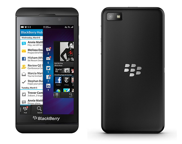
The Z10 makes an excellent first impression. It looks distinctly like a larger iPhone 5 — it has the same rounded corners and a strip of plastic runs across the face of the device above and below the screen, much like the two strips of glass that run across the top and bottom of the iPhone 5’s aluminum rear.
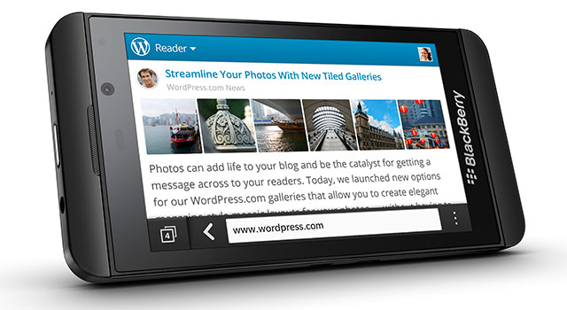
A slightly longer look quickly reveals the Z10 is isn’t just an oversized iPhone. Any doubts are removed by BlackBerry’s customary red notification light at the top-right of the display and the BlackBerry logo and name beneath the button-less, 4,2-inch display.
The logo is a little too big and blatant for our taste, but you can’t blame BlackBerry for wanting to brag about its return to form.
The left-hand edge of the Z10 houses the micro USB and micro-HDMI ports, the lock/power button is centred on the handset’s top edge, and the right-hand side is home to the aluminium volume buttons, which can also act as a camera shutter release. A third button, which works to initiate BlackBerry’s own voice control system or play/pause music, is nestled between them. The dimpled, rubberised rear cover carries BlackBerry’s logo and feels great – it’s sturdy, comfortable and reassuringly nonslip.
Beneath the rear cover, there’s the replaceable 1 800mAh lithium-ion battery, a hot-swappable slot for a microSD card — with an 8GB card supplied — and a micro-Sim slot. Though the battery isn’t enormous, we managed to get 10 solid hours of use out of the Z10 before it needed a charge, and even more if we weren’t checking every notification that came in, taking large numbers of photos, or rooting around in the phone’s menus for hours on end.
Every part of the Z10 seems intended to say two things: that this is a premium device and that this is as good as anything else you’ve ever seen.
Once you begin to interact with it, a third message emerges: this operating system — BlackBerry 10 — isn’t just new, it’s different.
Nonconformist
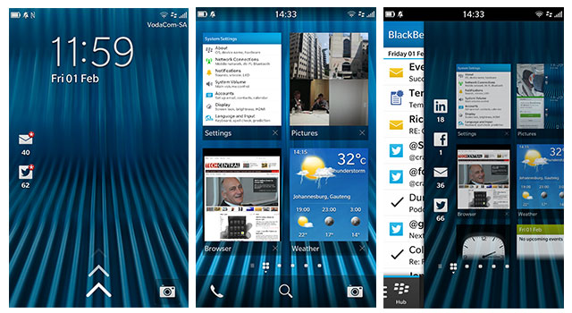
There’s no back or home button on the face of the Z10. In fact, there are no buttons at all. If you’re a seasoned smartphone user, it’s a little disconcerting at first. Key to the BB10 interface is swiping a thumb up from the bottom of the display’s logo-emblazoned bezel. This gesture unlocks the display — which can be done without a button press to wake the locked screen first — and also allows you to navigate between applications or back to the home screens.

The display itself is also unconventional insofar as there’s a slightly raised edge around the bezel. Most manufacturers, and Nokia in particular, have gone the other way — raising the screen higher than the edges of the device. We rather liked this decision to buck the trend with the raised edges making it easy to unlock the device by feel alone.
The Z10’s display stands its ground against most current top-end devices. It offers 1 280×768 pixels for a respectable pixel density of 356ppi. Text and images looks equally superb on it and viewing angles, contrast and colour are all excellent.
Say cheese
As is to be expected from a flagship handset, the Z10’s camera captures 8-megapixel stills and either 1080p or 720p video.
Controls for video and stills recordings are straightforward, with only three options to choose from: stills, video or a “Time Shift” mode.
The first two shooting modes are self-explanatory, while the third essentially takes a series of stills and then lets you move a slider to choose the best frame. More impressively, if it detects faces in the scene you can perform the same selection function on each face — meaning you can match the best pose with the best expression. The face detection is a little sketchy in anything other than great light, and it doesn’t always pick up all faces in a shot but, when it works, the feature does what it says on the box.
Although the quality of the images from the Z10’s rear camera, and even those from it’s 2-megapixel 720p video-shooting secondary camera, is great, less enthralling is the limited selection of controls on offer and the decision to ensure the focus indicator is always centered on the display when firing up the camera or between shots.
Moving the focus point requires holding and dragging the indicator, rather than tapping the area upon which you wish to focus, and tapping anywhere on the screen captures a shot. The problem with this approach is two-fold. Firstly, because most other manufacturers opt for tap-to-focus, BlackBerry’s approach isn’t intuitive. Secondly, it’s a slower solution.
The same is true of the camera launch button on the lock screen. Rather than simply swiping to open the camera, you have to hold the shortcut icon until an onscreen ring fills with colour. This prevents accidentally activating the camera in your pocket — a battery-draining mistake to be sure — but it means you’re looking at around three seconds to get from the lock screen to a camera that’s ready to fire. For what’s meant to be a quick access solution, it’s too clumsy and too slow.
There’s no doubt at least some of these issues will be fixed by third-party applications in due course, and perhaps BlackBerry’s interface decisions are predicated on patents owned by others. There’s nothing lacking in the images themselves, but the interface isn’t conducive to speedy snapping.
The brawn
With smartphones, it’s becoming less important what precisely the hardware specifications are as long as they’re in the same league as rival devices, and in the Z10’s case they are. Beneath the bonnet there’s a dual-core 1,5GHz processor and a generous 2GB of RAM.
There’s the usual selection of 3G connectivity alongside the usual GPS, Wi-Fi and Bluetooth, and some carriers will offer the 4G/LTE-enabled versions of the Z10.
As with any high-end device, the Z10 packs in an accelerometer, magnetometer, gyroscope and ambient light sensor.

It’s a given that most of the flagship devices rival manufacturers will release this year will offer full-HD displays — with the exception, perhaps, of Apple — and even faster processors, but the Z10 should be able to hold its ground against them for some time. Furthermore, it has the advantage of being available in South Africa from next month.
The brains
BlackBerry 10 is all about gestures, a feature the company calls “Flow”, and arguably the most important of these is swiping up from the bottom of the display, along with a variant that involves swiping up and then to the right, like writing a lowercase R with your thumb.
The simple swipe up in any app reduces the program to a panel one quarter the size of the screen. The Z10 allows users to store up to eight open applications across two screens displayed one on top of the other.
Where applicable, once an application has been sent to this display area it will show pertinent information on its panel. The weather app, for example, will show current conditions and those for the hours ahead, while the calendar app will display upcoming appointments. The result is the sort of live tiles Microsoft aimed for with Windows Phone but didn’t implement as well as BlackBerry has done here.
Swipe up and right in any application, or on any of the home screens, and the BlackBerry Hub is displayed down the left-hand side of the screen. In the Hub, users can opt either to view a unified inbox of their notifications for everything from BlackBerry Messenger (BBM), SMS and multiple e-mail accounts to social media notifications, listed chronologically. Alternatively, they can look at a single account or inbox.
While in any individual category view, a swipe to the right will take you back to the Hub view. This ability to “Peek” at incoming mail, messages and social media notifications from any running app is designed to prevent users having to return to a home screen and fire up a dedicated app each time a notification comes in. BlackBerry has clearly thought about this function carefully, and the swipes that power it become second nature very quickly.
While Android devices offer notifications that can be used to navigate directly to the applicable app with a touch, BlackBerry has gone a step further and dedicated a readily accessible portion of BB10 to what it considers the key functions of a smartphone. It’s a smart move. By comparison, Apple’s icon-and-notification approach looks positively dated.
Pulling a thumb down the display from the top opens a settings menu with shortcuts for toggling connectivity settings on and off and provides access to the settings area. Within an app, it offers settings for that particular software.
E-mail and text
The Z10 offers supports for a work e-mail address and e-mail managed by the BlackBerry Enterprise Service (BES), Microsoft Exchange ActiveSync, Gmail, Hotmail, Yahoo, IMAP, POP, calendar protocol CalDAV, and contact protocol CardDAV.
There’s also the BBM service, which, along with its e-mail capabilities, first made BlackBerry such a smash hit with consumers. Now, however, the interface has been given a bit of spit and polish and BBM supports voice-over-Internet protocol (VoIP) and video calling.
It’s been suggested by some industry pundits that BlackBerry may encourage operators to offer the text component of BBM for a flat rate, much like the BlackBerry Internet Service (BIS) used on devices running BlackBerry 7 and earlier versions of the software. But we won’t know whether or not they’re going to take that approach until the products actually hit the market next month.
BlackBerry has always prided itself on making text input easy, and with the Z10 the company has pulled out every conceivable stop to streamline the text-creation process. Typing on the Z10 is a delight. The keyboard is adaptive, so over time it will adjust to allow for the fact that when you try to type a W you tend to err a little too much on the side of the Q.
Furthermore, BlackBerry has included a form of predictive text that tries to anticipate a word as you type it and displays it above the next letter you’re likely to type. If it’s guessed correctly, swiping up on the letter in question will insert the word and a space. When the device gets a string of words right, it means a few swift swipes can complete the sentence.
Over time, the predictive text improves, too, and BlackBerry has gone as far as getting BB10 to trawl your e-mail, BBM and other services to learn your writing habits. Thus, an e-mail from your business account should see more formal suggestions for auto-complete, while BBM might offer more casual language.
Swiping to the left erases the last word typed, and swiping down on the keyboard switches between the letter and symbol/special character keypads. Like any new keyboard, the Z10’s tricks require a little practice but, once muscle memory begins to form, it’s easy to see how one could input text on the device at an incredible clip.
Tell your friends
Speedy text input is a great aspect to focus on given how much time most smartphone users spend typing.
BlackBerry has also sought to integrate the sorts of apps one is most likely to spend time typing in directly into BB10. This includes integration with note-taking app Evernote and social media services LinkedIn, Facebook and Twitter.
The company has also been sensible enough to have applications like the wildly popular cross-platform instant messaging service WhatsApp available in the BlackBerry World store at launch. WhatsApp is a rival to BBM, but users want it, and at least the company realises — much like Apple did by allowing Google Maps into the App Store — that meeting consumers’ desires is more important than imposing your own services on them.
BlackBerry has gone to a lot of effort to talk about the number of applications that will be available for BB10 at launch, and with good reason: an operating system is only as good as the apps available for it.
BlackBerry claims 70 000 applications will work with BB10, but that’s a little misleading. “Work with” is not the same as “designed for”, and the bulk of those apps have been ported from BB7 or Android.
Nevertheless, there are around a thousand apps made specifically for BB10, including favourites like WhatsApp and Dropbox and Box. Even First National Bank and Nedbank’s banking apps are represented, as are games like Angry Birds, reading services like Amazon’s Kindle app and local services DStv Mobile and News24.
There are, however, a few notable omissions. These include apps for Google services that are available on iOS and Android and social image app Instagram. The latter will no doubt follow eventually, assuming the platform proves sufficiently popular to warrant it, and the former is mostly mitigated by competent built-in integration of key Google services like Gmail and Calendar.
Still, those who are deeply embedded in Google’s ecosystem may long for more. For example, if you have multiple Gmail accounts linked to a single one, it’s not possible to send mail from anything other than the address used to set up the account. The same challenge arises for those using multiple calendars. While it’s possible to view the content of every linked calendar, events can only be added to the core calendar account.
Finding its way
While the Z10 offers an excellent and agile browser, competent business tools like DocToGo — which allows for the creation and editing of Microsoft Office documents, spreadsheets and presentations — and slick music and video players, one area in which it is seriously lacking is mapping.

The built-in Maps app has a setting for displaying traffic info, but doesn’t actually do so. Its maps look thorough but there’s no offer of turn-by-turn navigation. If the Z10 wants to be considered a fully fledged smartphone, either BlackBerry needs to pay a third-party mapping company for the use of its data, or it needs to allow for third-party apps that will make up for this shortfall.
Conclusion
With the Z10, BlackBerry set out to silence its detractors, demonstrate that it could build a smartphone as capable as anything else on the market, show existing BlackBerry users the company is serious about innovation and about earning their ongoing loyalty, and offer something fundamentally different from its rivals. On the whole, it has succeeded.
Some bugs and niggles remain, like the odd short-lived frozen screen when running multiple apps, and the inability to swipe out of some apps that insist on using landscape orientation. But in all, it’s an excellent first product for a new platform.
The biggest challenge facing BlackBerry isn’t going to be getting current users of the company’s devices to upgrade to it — even without BIS, the falling cost of data makes the Z10 a desirable device — but to get those who’ve defected to Android and iOS to embrace the platform again.
Given its feature set and pricing — it’s likely to cost between R6 000 and R8 000 when it goes on sale in South Africa — it will be out of the reach of most of the company’s primary user base. But at least BlackBerry now has a high-end handset that’s worth coveting and talking about. — (c) 2013 NewsCentral Media


