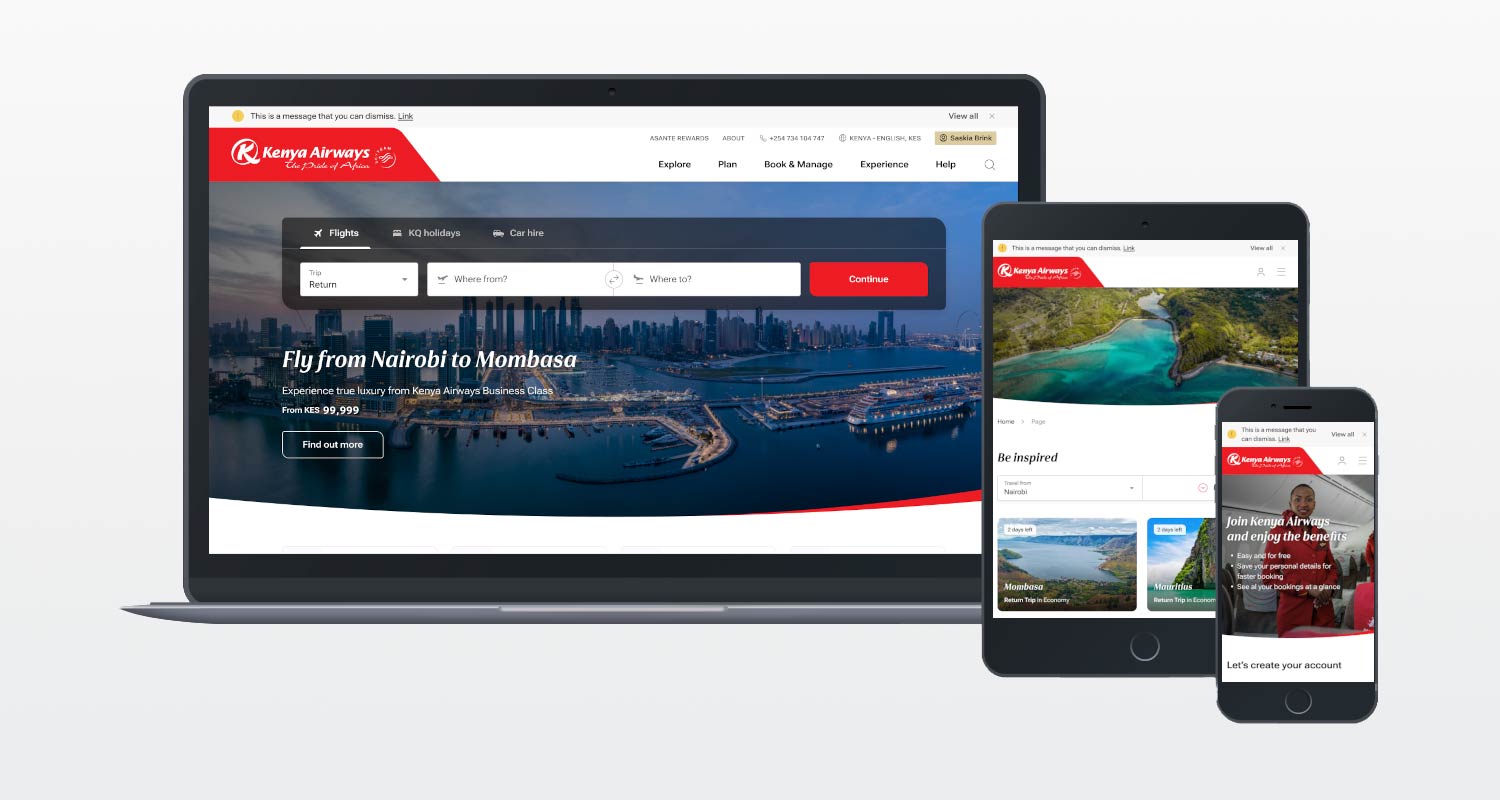
 Kenya Airways, a member of the Sky Team Alliance, is a leading African airline flying to 42 destinations worldwide, 35 of which are in Africa.
Its fleet comprises a number of wide-body Boeing aircraft, including a flagship B787 Dreamliner, in addition to the narrow-body Embraer E190 aircraft.
Kenya Airways (KQ) product portfolio includes the cargo business, KQ Cargo, a holidays and destinations product called KQ Holidays, an International Air Transport Association (IATA)-accredited aviation school called KQ Pride Centre, an aviation technology unit called Fahari Aviation, and the Kenya Airways Medical Centre.
Kenya Airways takes pride in being at the forefront of connecting Africa to the world and the world to Africa through its hub at the ultra-modern terminal 1A at the Jomo Kenyatta International Airport in Nairobi.
The problem to solve
Kenya Airways wanted to create a market-leading digital platform, improving both the user experience and design for the KQ commercial and corporate websites.
Its previous website lacked a user-friendly booking experience and didn’t allow customers to quickly and intuitively use geolocation technologies to find the best deals for their destination criteria.
The website also lacked a view of all Kenya Airways’ destinations on an interactive Google map and didn’t allow customers to make a booking without leaving the map.
Lastly, the airline needed an enhanced check-in system to provide guests with a seamless user journey.
How Bluegrass helped Kenya Airways
One of the key requirements for the new website was an improved and robust content management system (CMS). Kenya Airways selected Optimizely CMS, an enterprise digital experience platform (DXP), as the platform of choice.
Optimizely simplifies managing digital activity and customer experience across every touchpoint. Furthermore, Optimizely comes out of the box with enterprise-level functionality including geolocation services, content intelligence and recommendations, personalisation of content based on chosen criteria, A/B testing, search indexing, and more.
As an example of this content personalisation functionality, the website can identify where a particular user is browsing from – let’s say Dubai – and then present that user with a different promotional banner or with content based on deals the airline might be running when the user is planning to travel.
Optimizely’s Search and Navigation product offers powerful indexing to enable an improved search function, with functionality like content boosting, instant “predictive” search and content recommendations. And because the website attracts visitors from across the world, the ability to leverage Optimizely’s multilingual and multi-currency functionality – with geolocation built into it – means that the new site is geared to cater to a diverse customer base.
 But before Kenya Airways could get to any of the fancy functionality, the Bluegrass team knew that it needed to take the time to gather information and run extensive fact-finding workshops to ensure it had a comprehensive understanding of the problem it was trying to solve. This would inform its user interface design and was probably the most important part of the project.
As part of its approach, and together with the client, Bluegrass Digital scoped out everything, including all third-party integrations. It developed relationships with these third-party stakeholders to ensure that the new website featured the necessary functionality for the integrations to run smoothly.
Additionally, Bluegrass analysed historical customer support data including e-mails, call logs and complaints, and looked at analytics data indicating page drop-off numbers to identify potential customer pain points. The analysis revealed, for example, that a lack of clear error signposting existed while trying to book a flight. This meant that customers weren’t given any guidance around how to rectify an error when something went wrong while booking.
Also, customers were left frustrated by the fact that if they needed to reach out to the airline directly and weren’t sure how to do so because the relevant contact information was not easily available. The information was on the website, but it was difficult for users to find.
With these problem areas in mind, Bluegrass Digital knew that the design and layout of the new website had to bring the most essential information to the homepage and into the main navigation panel, so that customers had no trouble finding solutions to their problems.
What’s more, Bluegrass conducted user interviews and hosted workshops with real customers where it ran through multiple scenarios to uncover key challenges and obstacles faced when booking a flight. Customers were asked to complete the exact same task across three different airline websites. The goal was to see which processes they found easy on other websites so that Kenya Airways could use these learnings and insights to improve the UX on its new website.
Based on all this information, Bluegrass created fully interactive and clickable wireframes and prototypes that it put in front of the client. It also ran additional tests with users to find out if its new designs allowed customers to better solve the problems they were struggling with. These interactions allowed Bluegrass to make further improvements and tweaks to the website.
Integrations
To ensure that everything ran smoothly on the front end, Bluegrass had to engineer several integrations with the third-party providers that work with the airline on the backend. These integrations made it possible to do things such as displaying flight prices on the calendar widget so that customers have an idea of pricing for their chosen dates before they even hit the Search button. And thanks to Google Maps integration, customers can now view the airline’s destinations on a map and book directly from that map view. The website also features several handy alerts to let passengers know if there is a flight delay or to share news in the event of a larger incident in play.
The results
The redesigned website is fast-loading, mobile-friendly, location-intelligent, and more intuitive and interactive.
Website performance has improved significantly, bringing a more than 100% increase in load speeds and increasing the rate of conversion. It is now an intuitive website, which makes it easier for customers to discover destinations and make a booking. The online booking journey can be started in three different areas on the website – from the homepage, deals page or route planner — and offers a proactive way for customers to confirm their travel requirements.
 It is still early days, but based on comments and feedback from customers, the response to the new website has been overwhelmingly positive. And Bluegrass plans to take these learnings further. Future plans will see the team updating and improving site functionality, including integrating the airline’s new Asante Rewards loyalty programme.
If you, like Kenya Airways, need help revamping your website so that you can offer a better customer experience and improve site conversions, we are the partner you need. To find out more, get in touch with us here.
- The author, Nicholas Durrant, is MD at Bluegrass Digital
- Read more articles by Bluegrass Digital on TechCentral
- This promoted content was paid for by the party concerned


