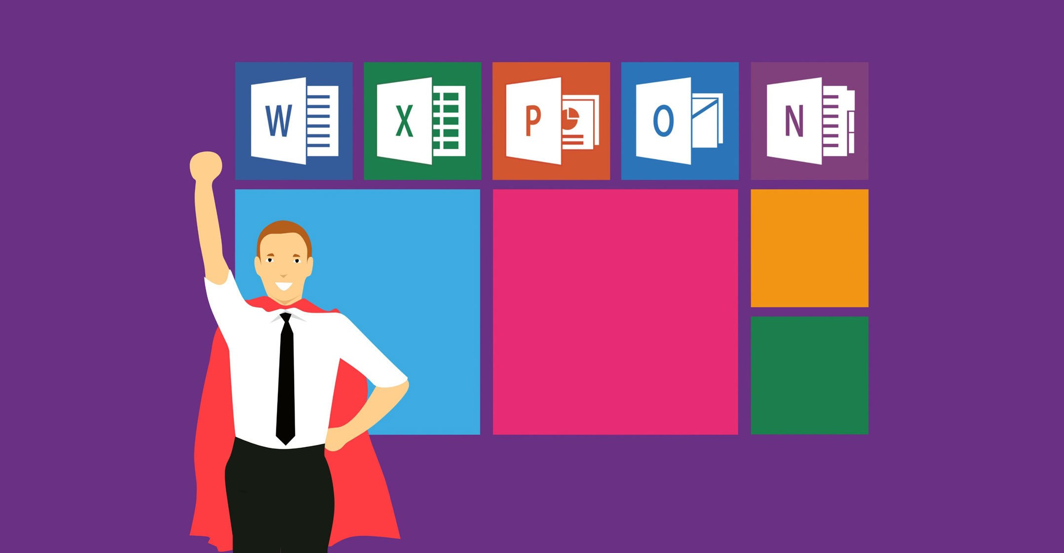
 Microsoft has redesigned the icons used for its Office productivity suite, the first time it has done so since 2013.
The icons have been “evolved” to reflect the significant changes that have been made to Office, said John Friedman, head of Office design, in a blog post.
“To support the changing world of work, Office is transforming into a collaborative suite that lets you work together in real time from almost any device,” Friedman said.
“We’ve infused our tools with powerful artificial intelligence: you can get insights from data with less effort, write a paper using your voice or make your resume using LinkedIn insights. We’ve also added totally new apps to the suite like our AI-powered meetings and chat service, Microsoft Teams.”
He said the new icons are “bolder, lighter and friendlier — a nod to how Office has evolved”.
“We also used gestalt principles to further emphasise key product changes. Simplicity and harmony are key visual elements that reflect the seamless connectivity and intuitiveness of Office apps. While each icon has a unique and identifiable symbol, there are connections within each app’s symbol and the collective suite.”
Decoupled
Microsoft has decoupled the letter and the symbol in the icons, essentially creating two panels (one for the letter and one for the symbol) that can be paired or separated. “This allows us to maintain familiarity while still emphasising simplicity inside the app. Separating these into two panels also adds depth, which sparks opportunities in 3D contexts. Through this flexible system, we keep tradition alive while gently pushing the envelope.”
Whereas prior Office icons had a document outline for Microsoft Word and a spreadsheet outline for Excel, it now shows lines of text for Word and individual cells for Excel. “By focusing on the content rather than any specific format, these icons embody the collaborative nature of the apps they represent.”
The letter-to-symbol ratio has also been changed. Traditionally, the letter occupied two-thirds of the icon, and the symbol took up one-third. “We’ve changed this ratio to now emphasise the symbol because, while the letter represents the tool itself, the symbol speaks more to people’s creations.”
The new icons will roll out across the various platform on which Office runs “in the coming months”, starting with mobile and Web. — (c) 2018 NewsCentral Media


