The ThinkPad line has always been synonymous with great build quality. Lenovo, which bought the brand from IBM with its acquisition of Big Blue’s PC business in 2005, has built on that reputation, especially with the X1 Carbon line of ultraportable and professional-grade PCs.
With the latest, the 2014 edition of the ThinkPad X1 Carbon and Carbon Touch line-up, Lenovo has taken an already very good product and made it even better — for the most part.
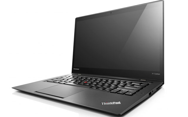
Taking the X1 Carbon — we reviewed the 1,4kg touch-screen version — out of its box reveals little immediately that is much different to the previous generation. Encased in a gorgeous black plastic shell, the machine remains lightweight and super thin and, while not as portable as the MacBook Air, packs in a lot more hardware punch than the Apple ultraportable.
This is undoubtedly a machine for well-heeled professionals who demand a powerful Windows laptop that is also sleek and supremely portable.
Flipping the X1 Carbon’s lid open it’s immediately clear this is no minor upgrade. The most notable change — and biggest improvement — is the new, high-resolution screen that falls into “Retina” territory, to borrow Apple’s term for its high-definition displays.
The increase in resolution, from last year’s model’s 1 600×900 pixels to a stunning 2 560×1 440 pixels makes the 14-inch display almost sparkle, even though it’s matte (on both the touch and non-touch versions). Anyone who has used a Retina MacBook Pro will know the impact the resolution boost has: fonts, in particular, are noticeably sharper. Reading the Web or documents is a pleasure.
However, we were surprised to find that not all applications support the hi-res display, most notably Google’s Chrome Web browser, which rendered text in a distinctly pixellated and low-resolution way. Apparently, it is possible to hack some settings to get Chrome to display correctly, but we simply switched to using the equally capable Firefox instead.
Battery life is noticeably better, too, though capacity remains at the 2013 model’s 45Wh. But we managed at least an hour more on average than the three or four hours we eked out of the 2013 model, probably thanks in large part to the fact that it packs a low-power Intel “Haswell” processor.
The 2013 non-touch version got up to an extra hour of juice, so, unless you spend a lot of time in Windows 8’s tile-based “Metro” interface, we’d advise steering clear of the touch model. Business users are likely to spend most of their time using Windows in its traditional desktop mode anyway and the extra battery life will prove much more useful.
Other big changes have been made to the new X1 Carbon, most of them positive, but there have been one of two design decisions that make no sense at all — and will serve to infuriate those upgrading from the older model.
The good stuff
But first, the good stuff. Lenovo has rejigged the placement of parts completely. The Core i7-4550U processor (the version in our review model) has been moved to the right, rather than being located next to the power port on the left. Most of the time, it doesn’t run nearly as hot as the processor in the previous generation X1, which, as users of the older model will attest, can get warm enough to become uncomfortable on a bare leg. But put the hardware through its paces by firing up a high-end game and things get quite toasty. Of course, this machine isn’t aimed at users requiring resource-intensive applications like games or those wanting to edit hours of high-definition video.
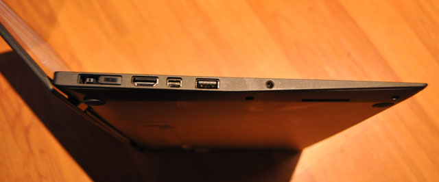
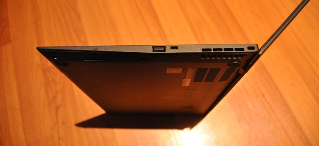
The left-side of the machine houses the power socket and docking station port (new to this model), 3,5mm audio jack, a full-sized HDMI port and DisplayPort and a USB 3 port. To the right, alongside the processor’s cooling vents, are a proprietary gigabit Ethernet port (a dongle is included in the box), another USB 3 port and a Kensington Security Slot.
The Kensington lock is important in a machine this pricey. In fact, security is clearly one of Lenovo’s main focus areas with the new X1, which includes hardened Bios security settings, hard drive encryption, Intel’s Anti-Theft/Computrace technology, a fingerprint scanner and integrated cryptoprocessing technology.


On the back is a Sim card slot, which allows mobile connections of up to 42Mbit/s over evolved high-speed packet access networks. The Wi-Fi module includes the snappy new “ac” standard.
The most controversial aspects of the new X1 Carbon involve changes made to the keyboard, which has had a radical overhaul over previous models — and the amendments are not all for the better.
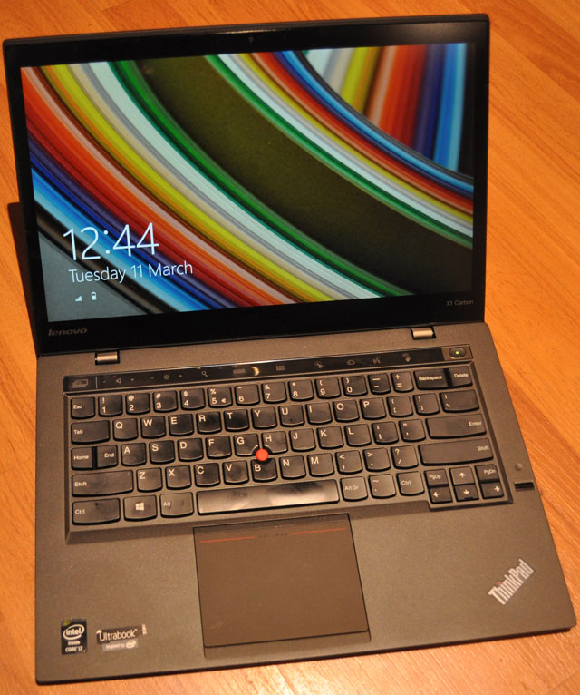
Bizarrely, Lenovo has moved the “Delete” key to where the “Backspace” key used to be. “Backspace” has shifted one key space to the left. The predictable result: we’d constantly hit the “Delete” key when meaning to hit “Backspace”. Even after days of using the machine, we still couldn’t get it right. It’s an infuriating design flaw.
Another odd decision is replacing the “Caps Lock”, above the left “Shift” button, with dual “Home” and “End” buttons. To switch on caps lock, one now has to double-tap “Shift”. We often found we’d enabled caps lock by mistake. It’s not as bad as the “Backspace” issue, but it’s still a poor design decision in our view.
Thankfully, the problems with the keyboard end there. Lenovo has kept the Chiclet-style keys, which remain comfortable and firm under the fingers. Touch-typing is a pleasure. Also unchanged is the familiar red “pointing stick” found on other ThinkPad models. Some users swear by it — we certainly do — but those who prefer a touchpad will find the one on the new X1 more than up to the job.
Another controversial design decision — but one which we think actually works — is that Lenovo has removed the traditional Windows function keys, replacing them with a touch-sensitive panel above the number keys. Pressing the “Fn” soft-button at the left of the panel cycles between five available panel options (among them a browser mode and a conference mode), with a wide range of settings on offer.
There’s a soft-button to bring up an applications list, for example, and another to cycle through open apps. There’s even one to enable aeroplane mode. We particularly liked the search button, which calls up Windows 8’s search centre. Unfortunately, the icons cannot be changed.
We also liked a new camera gestures mode that make use of the integrated camera to control applications. In a music player, for example, holding up an index finger to your lips mutes playback while swiping to the left skips to the next track. It can also be used in PowerPoint to flip between slides or in a PDF reader to flip between the pages of a book.

There’s an option, too, to drive the X1 using your voice. But for the life of us we couldn’t get it to work. It didn’t support South African English and changing to UK English didn’t help either. Documentation suggests it may simply not be available at all in certain regions, including South Africa.
Hefty price
All in all, Lenovo has delivered a solid upgrade to what was already a very good Windows ultraportable. Even if you already have the last model, the company has probably done enough to warrant an upgrade, particularly with that wonderful, high-density display.
The improved (but still not stellar) battery may convince some buyers, while others will be attracted to the fact that it finally supports docking stations.
The X1 Carbon Touch — our review model was supplied by technology distributor Mustek — has a recommended retail price of R32 799 including VAT. That includes a 256GB Samsung solid-state drive and 8GB of RAM.
If you’re in the market for a business-focused Windows ultraportable (and for practical or ideological reasons the Retina-based MacBook Pro is not an alternative), then the new ThinkPad X1 Carbon (or the Touch) should probably be near if not at the very top of your list of options. — (c) 2014 NewsCentral Media


