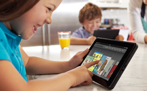
Online retailer Amazon.com’s Kindle Fire isn’t really a Kindle at all. It’s a 7-inch tablet designed to be a media consumption tool and little else. Arguably, this is what most people use any tablet for and it’s why, in the US at least, the fact that it also costs less than most competitors’ offerings means it’s going to do very well. In SA, though, we’ve learnt it’s a fundamentally crippled device.
The Kindle Fire has a colour LCD display, rather than the e-ink technology found on its namesakes. It lacks the page-turning buttons found on Amazon’s traditional e-readers and is intended for far more than just text. Really, it’s a 7-inch tablet running Android, albeit Amazon’s version of Android, which looks little like other manufacturers’ implementations of the Google operating system.
From a specifications perspective alone, the Fire is a fairly pedestrian tablet — there’s only one button (the on/off and lock button); the screen resolution is 1024×600 pixels; it’s a bit thick at 11,4mm and a bit heavy at 413g (Samsung’s 7-incher weighs 345g); it has no cameras or microphone and no 3G aerial; and it offers only 8GB of internal storage with no option to expand that via SD cards.
But, as the Apple’s iPad continues to demonstrate, the majority of people aren’t interested in the minutiae of specification sheets. Most people want two questions answered: “How easy is it to use?” and “What can I do with it?”
The answers to those questions are why the Fire is going to be a runaway success, in the US at least. It’s incredibly easy to use, and for Americans — and those in other regions Amazon gets around to supporting — there are more than 17m songs and more than 1m books to choose from as well as in excess of 100 000 movies and TV series and a wide range of magazines and other periodicals.
As a device designed for media consumption, it also includes two speakers that offer decent-quality sound for a device so small and cheap.

Unfortunately, outside the US, users have access only to the reading matter on offer. The device will happily play movies or music you put on it – an effortless process that simply requires connecting the Kindle Fire to a PC or Mac via microUSB and dragging and dropping content onto it – but attempts to buy movies, series or music with a non-US credit card are met with error messages.
For the technically savvy, there are (complicated) ways to circumvent Amazon’s geographical detection methods, but this is something most consumers won’t want to have to figure out.
Nevertheless, Amazon deserves credit for taking Android and taming it into an inviting and user-friendly interface that makes the Fire as easy to use as an iPad.
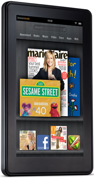
The entire interface resembles a bookshelf. The homepage offers the option of placing four favourite items – these can be applications, books, movies or anything else the device can hold — along the bottom of the screen. The middle of the display holds a carousel of recently used items, while the upper portion has a search bar and the main navigation menu. And a bar at the very top of the screen displays information about Wi-Fi and battery status, the time, and the name of the device.
The navigation menu includes Newsstand, Books, Music, Video, Docs, Apps and Web. The device comes preinstalled with applications such as the Web feeds reader Pulse and a comic book reader called Comics. Also included are apps for IMDb (the movie database), e-mail and Facebook, plus productivity tool Quickoffice.
In each menu category there’s the option to view content that is either on the device or on Amazon’s servers — like a prior book purchase that you haven’t downloaded to the device yet.
Amazon claims the Kindle Fire’s Web browser, called Amazon Silk, is faster than rival browsers due to some compression skulduggery behind the scenes. It certainly feels a little snappy and pages load marginally faster when tested against another tablet.
The handling of tabbed browsing and bookmarking is done well — tabs simply queue up along the top of the screen with an X in the corner to close them, and bookmarks are diplayed as captioned thumbnails — resulting in one of the better tablet browsers we’ve used. It’s similar to most competitors’ offerings, but also cleaner than many of them.
Despite its fairly modest, 169ppi resolution, the screen looks superb and makes magazines look incredible.
The Fire is all about content, and in the same way the iTunes store made the iPod and the App Store made the iPad, it’s this content that really makes the Fire such a compelling proposition, particularly considering its diminutive price tag. However, as the bulk of that content isn’t available in SA, it’s difficult to recommend it to local consumers, particularly those that don’t have the technical nous or inclination to work around the restrictions.
It’s a lovely piece of hardware with a fantastic interface but, without access to the content it was designed for, it’s a glorified — albeit fairly inexpensive — media player. — Craig Wilson, TechCentral
- The Kindle Fire is available in SA via various importers and online retailers. Review unit supplied by Wantitall.co.za.
- Subscribe to our free daily newsletter
- Follow us on Twitter or on Google+ or on Facebook
- Visit our sister website, SportsCentral (still in beta)


