[By Alistair Fairweather]
I’m not the biggest fan of Microsoft. I’ve made that pretty clear over the years. The company has spent a decade in various degrees of stagnation, largely thanks to keeping Uncle Fester’s evil twin as its CEO. It has made a string of expensive and stupid acquisitions, including buying profit-less Skype for US$8,5bn and pumping a reported $1bn into an ailing Nokia in an attempt to buy its way into a market in which it has proved too inept to make its own way.
And it has let the new Gang of Four (Apple, Google, Amazon, Facebook) colonise all the vibrant new markets from mobile phones and tablets through to search and social media. After two decades of almost complete dominance in the realms of software, Microsoft now looks like a bit of a lame duck.
And so when I heard about Windows Phone 7, it was all I could do to stifle a yawn. “Wow,” I thought, “so Microsoft has finally caught up with the iPhone circa 2007. Pity it’s 2011.” (I’m a lot more sarcastic in my head than I am out loud.) I’ve never seen a Microsoft mobile device that impressed me in the least bit. Its Windows CE devices were just depressingly bad — at least the ones I saw and played with anyway.
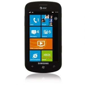
And so when I picked up Chris Rawlinson’s new Samsung Focus running Windows Phone 7 “Mango” — the latest version of the operating system — I wasn’t expecting much. I’m an iPhone guy, and a snob, and (as I’ve said) I have pretty clear feelings about M$oft.
The interface is much slicker and more beautiful than any of the videos I’d watched led me to believe. Samsung’s beautiful Amoled screen certainly helps. It seems a little less sharp than the iPhone’s retina display, but the colours are incredibly vivid. Having grown up under the yoke of Microsoft’s trademark interface design ethos (that is, difficult, fiddly, clumsy and flat), I was expecting Mango to be more of the same. It’s not. Intuitive, fluid, immersive and reactive — this is a great user experience. It’s quite different from the iPhone, but for once “different” doesn’t just mean “we changed it so we wouldn’t get sued” or, even worse, “crap and poorly thought out”.

I particularly enjoyed the active panels on the home screen, and the way social media and your contacts list are so neatly interwoven. The interface isn’t just a product of care and thought, but of passion and joy — things that have lacked in so many of Microsoft’s core products for years.
And so, I am eating humble pie. Microsoft, I will stop jeering at your failure with the aborted Kin, and at the crapness of Windows CE. Your mobile team has really impressed me, and that takes a lot.
Whether Mango will be enough to reverse the stranglehold that Android, Research in Motion and Apple have on the market is another question. It would tragically ironic if Microsoft finally found its mobile mojo two years too late. It’s going to have to pump billions into its applications platform in order to get a brand new ecosystem off the ground from a standing start. Without the buy-in of third party developers they are just not going to be able to make any headway.
But the Nokia deal is starting to look a little less foolish. If Nokia’s manufacturing scale can be combined with Mango’s beauty in a pleasing package, then Nokia has a chance to rise from its early grave. The problem is that both Nokia and Microsoft will have to spend their way into the market even to be heard. The momentum is not on their side.
Be all that as it may, the Focus is a beautiful device, running a beautiful operating system. I am still happy with my iPhone, but I can imagine this bad boy is a lot of people’s idea of heaven.
- Alistair Fairweather is digital platforms manager at the Mail & Guardian
- This piece was originally published at alistairfairweather.com and is reprinted with permission
- Subscribe to our free daily newsletter
- Follow us on Twitter or on Facebook


